
Ever feel like you’re posting random stories with no flow or vibe, like throwing spaghetti at the wall? I’ve been there too when great content felt missing that polished, scroll-stopping spark. The truth is, people judge your story layout in seconds. If it doesn’t look clean, cohesive, and a little curated, they’ll just tap away. I learned this the hard way when awkward cropping and cluttered text ruined my best posts. As a graphic designer at heart, I started to fix my approach by turning to smart ideas that feel natural.
Now, every post I create is packed with clever styles, not just 14, but countless concepts that can instantly level up your game. Whether you’re promoting a product, sharing daily vibes, or announcing a big drop, there’s always a design that fits your mood. It’s all about balance, breathing room, and that subtle visual rhythm in every idea I’ve crafted. Trust me, when your stories feel good and look effortless, you’ll see the difference.
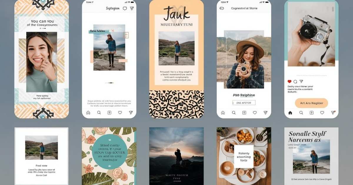
The Secret Sauce: 16 Story Layouts That Work
Before you start dragging photos into Canva or picking random fonts for your Stories, take a pause and think about your layout. A strong design isn’t just about where things sit it’s how your content breathes, flows, and hooks attention. When done right, even the most simple moments can turns into share-worthy visuals that look good. I’ve seen how the right tweaks can stop the scroll and keep your audience engaged.
I love using these 14 Instagram Story layout ideas because they work for promotions, daily updates, and maintaining aesthetic consistency. Each concept is designed to match your brand energy and make your Stories feel more intentional. Whether you want to stop the scroll with bold visuals or keep it soft and minimal, these layouts deliver. The goal is balance layouts that keep things simple yet crafted to elevate your content without breaking the vibe.
Grid-Collage with Mood Layers
A Bold approach to visual storytelling starts with adding subtle hints of emotion in a collage-style layout. I love playing with composition and a bit of asymmetry, creating natural movement through every cropped edge and frame. Using a soft selfie, serene clouds, and even sharp architecture adds a unique tone and pulse of cohesive energy. Mix light, muted blue tones in your images for an aesthetic moodboard, while a repetition like a striped shirt can act as an anchor, pulling the eye without too much text to explain. This feels like a masterclass in non-verbal narrative done right.
To make it dynamic, use Negative space as a smart role player. An open sky, cloud shots, and a little breathing room between intimate moments like a necklace close-up or profile portrait can prevent overwhelm while adding natural rhythm. Don’t worry if your grid feels a little overly raw that’s the magic. Slight edges that overlap, frames that aren’t perfectly aligned, and an intentional hint of chaotic beauty mirrors memory. It stays layered, unpolished, and emotionally rich. This style is Perfect for a story, recaps, morning routines, or even product storytelling that invites a pause, slows the scroll, and rewards the eye with detail from an earring glint to a tiny floating element.
May You Like Also: 650+ Best Luxury Captions for Instagram in 2025
Torn Frame Music Visual
Creating a striking Insta Story is all about playing with visual contrast and a unique layout that feels effortless yet refined. A torn paper overlay works like a textured divider, drawing the eye straight to the center without adding heavy graphics. It brings a rebellious twist while staying ideal for storytelling that carries emotional depth. Pairing a circular photo frame with lyrics creates a spotlight effect that feels moody, personal, and cinematic, almost like the viewer is peeking into a private moment. It’s perfect for music shares, vibe-led story posts, or even showcasing your favorite track in a way that feels aesthetic and deeply connected.
Using a layered blur background can deepen the focus on your subject, while a soft ghostlike duplicate adds that dreamy atmosphere without being distracting. Keep typography minimal and intentional, with lyrics centered beneath the circle, paired with clean icons for playback to make the design functional yet beautiful. A monochrome palette with black and grey tones always feels sleek, modern, and cohesive, ensuring everything is easy to read. Adding torn texture, subtle layers, and emotional detail gives the whole layout finesse a perfect way to turn ordinary content into an incredibly effective story that invites pause and feels like pure aesthetic magic.
Playful Photo Dump Collage
Creating an Energetic Insta Story that feels bursting with charm starts with a layout that adds a playful twist to the classic photo dump style. A diagonal photo arrangement not only keeps things dynamic but also helps in avoiding chaos. Each frame can be thoughtfully rotated just enough to add movement, making it look natural. Adding Decorative stickers, pastel doodles, and fun Characters like bunnies, bows, or rainbows can enhance the mood without overwhelming visuals, giving a soft nostalgic vibe that feels scrapbook-inspired yet trendy.
Typography plays a central role in tone-setting here. A title like “Today’s Dump” in bold rounded font immediately signals a casual daily-life vibe. Paired with hand-drawn elements, it feels personal and curated. Use Consistent lighting and outfit tones to unify the collage, so even a range of scenes like an ice cream moment, city walk, or restaurant table looks cohesive. A Visual hierarchy that’s smartly handled ensures Larger central images draw focus, while edge frames add fun accents without any element fighting for attention. This is Perfect for showcasing everyday snapshots with personality, making your layout invite viewers into a fun carefree moment, where every sticker and angle adds value without losing that effortless vibe.
Mirror Shot with Music Overlay
A confident and clean layout can make your Stories stand out without adding too much. A simple mirror selfie placed at the center stage, framed tightly for a personal and direct look, works best. Adding a blurred background layer of the same photo creates instant depth without extra elements, giving it a polished feel. The magic is in the minimalism, where every detail feels intentional yet effortless.
Use smart text placement to ground the design. Add the song title and artist subtly at the bottom for a soft musical vibe without making the visual too heavy. A string of icons on the top section adds a hint of personality and acts as visual punctuation that feels decorative, not distracting. Keep the color tones soft, muted, and natural so the outfit, café interior, and framing blend together. This layout is ideal for solo aesthetic moments like an outfit flex, a cozy café check-in, or a mirror pic, giving space for the subject while letting the music bring emotional context. It’s calm, centered, and truly scroll-stopping.
Vintage Street Diary Grid
When I first tried this layout, it felt like pure Nostalgia that oozes from every frame. I created a curated collage with a loosely structured grid, where each photo was a memory clipped from a summer day full of food, flowers, hands, and little heart signals captured on the street. Every element leans into texture, using grainy filters, matte tones, and visuals that evoke the feeling of old prints, like scrapbook polaroids. I even pinned a chai cup, earrings, and a lotus to add personality, giving it an analog-meets-digital moodboard feel.
The Spacing between images was tight yet intentional, letting each shot coexist without strict alignment. That little messiness works, because it mimics the rhythm of a real lived-in day, making viewers feel like they’re flipping through memories. The Typography placement at the bottom felt poetic, especially with the phrase “Feeling अंबरसरिया” in dual script, which added cultural weight. I loved how the soft yellow and white hues blend harmoniously with the warm background, making it personal, expressive, and totally non-commercial. To finish, a little date stamp and ft: @harini_pandi really bring that documentary style into the story, like a moment in time packaged on a page from a zine. Honestly, this style is Ideal for travel diaries, food explorations, or cultural mood posts a layout that truly wins for being raw and romantic.
Soft Focus Vertical Story Reel
A layout like this is all about warmth and serenity, and I love how it feels like a magazine spread when done right. Start with a large central image and a vertical sidebar for supporting shots, giving that editorial vibe with feature portraits on the left and creative cut-ins on the right. To make it visually striking, focus on color harmony think soft pink gradients flowing across the sweater, floral bouquet, and skin tones in all five frames. This creates a single mood that feels wrapped in light, giving cohesion without being repetitive.
Adding negative space is crucial to avoid a cluttered look. A blurred green background and open air between images help every photo breathe, letting the viewer take time to absorb the details. A small song tag like Wildflower at the bottom adds atmosphere and works as a storytelling tool, anchoring the soft visual narrative with sound. Keep it scroll-friendly by using strategically stacked images that are aligned cleanly on the side, creating a smooth reel of expressions without disrupting the dreamy tone. This style is perfect for soft outfit reveals, emotional moments, or garden shoots, blending personal storytelling with visual poise for an effortless, tender, and calming Insta story.
January Dump Moodboard
If you love vibrancy and spontaneity, this layout will make your story look like a visual diary. It feels like a mental scrapbook raw, fast-paced, and emotionally layered. Each frame is outlined with sketch-like white strokes, adding a playful cut-and-paste scrapbook effect. The image placement rejects symmetry to favor movement, using Polaroid-style layering with unpredictable angles that mirror randomness from real memories. The layout flows naturally across the screen, giving it a free-spirited feel.
I love using handwritten text like Coffee, Moon, and Peace as small captions, which softens the overall tone and adds personal labels, just like in a journal. Visible timestamps and messages turn it into more than a photo dump it’s a peek inside your mindset. Play with color contrast using warm browns, soft blues, and grayscale tones that bounce together to create visual rhythm without chaos. Add musical overlays, lock screen quotes, and little emotional touches to make the storytelling powered by moments, not perfection. This scroll-worthy frame is perfect for memory recaps, end-of-month vibes, and capturing randomness with intention.
Audio Card Carousel on Cloud
Imagine a dreamy Instagram story where minimalism meets digital storytelling in a layered layout that feels almost like a playlist brought to life. I once experimented with faux audio cards that seemed to float in a pastel sky, creating an illusion of album covers suspended in mid-air. The effect was cinematic, yet lightweight, with each card subtly flipping to reveal Song titles and artist names in clean Typography. This purposeful design mimics iPhone’s native music interface, adding a sense of familiar, tactile touch that sparks emotion and instant recognition.
To make it visually engaging, I focused on gradient shadow stacking to create depth, ensuring nothing sits flat. Each audio card slightly overlaps, enhancing the feeling of a real-world flip-through, while repetition and variation in pose, vibe, and shot location keeps the visual tight, yet full of dimension. The central figure becomes the character, almost like a subject in a lyrical flair, supported by calm blues and a wistful aesthetic very Lana Del Rey-coded. To anchor the whole layout, I used bold phrases like NOW MY LIFE IS SWEET LIKE CINNAMON, which offsets the softness and adds a moodboard-style storytelling twist. It’s the Perfect moment for music lovers, a personal style choice that turns immersive and melodic, making every story form feel like its own mini album cover recap.
Polaroid-Stacked Mirror Montage
When retro charm meets a modern vibe, you get a punchy layout that feels both nostalgic and stylish. Start with a monochrome mirror selfie that anchors the scene, then let vibrant polaroid-style snapshots orbit around it for a frame-within-a-frame effect. This mix of casual tilt and a little chaos makes it look so real. Add some playful layering that mimics old-school bulletin boards, keeping it messy, expressive, and totally intentional. A Black-and-white background locks the focus on the polaroids, while the contrast and sharp graphic style make it instantly eye-catching.
Now bring in personality. Drop speech bubbles, quote overlays, or even inside jokes like “Happy Birthday ❤️” or “Gucci gang from 2006 😤” for that character-driven energy. Sprinkle scribbles, stars, and teddy bear doodles to soften the layout’s edges and give it that zine-like feel. The mix of bold and cute elements makes the design look curated with care but still playful enough to feel cool. This idea is perfect for birthdays, throwbacks, or creative collages that turn a simple mirror pic into a stylish, sassy, and memory-soaked story everyone will love.
Vertical Strip on Coastal Canvas
There’s something about elegance and unity in a layout’s flow that feels both calm and purposeful. I love using a vertical collage strip with eight evenly spaced snapshots floating over a dreamy beach background. It instantly softens the visual tone and adds muted pastel tones that maintain cohesion with outfits, water, and sky, all echoing a breezy, carefree vibe. There’s no clutter or abrupt contrasts, just a palette that breathes harmony.
Adding text with effortless, almost poetic placement like “Our hearts beat Zeta” or “Go Greek” in handwritten-style overlays that blend seamlessly into the oceanic backdrop gives the design a soft-spoken charm. Photo spacing in the collage column should feel clean, with consistent margin to prevent visual crowding. A narrow alignment helps keep the focus tight on memories being shared. I often use framing with filmstrip-style borders for that retro-sorority scrapbook feel, which elevates casual snaps into storytelling artifacts, blending modern digital design with old-school analog energy. It feels tailor-made for chapter recaps, summer break dumps, or recruitment season moments always warm, polished, and full of spirit.
Soft Scrapbook with Floating Layers
There’s something charming about a scrapbook-inspired layout that captures a candid day-in-the-life moment with an artistic twist. The light beige gradients in the background bring a cozy warmth, instantly setting the tone before a single photo even appears. What makes this idea stand out is the use of floating frames that break traditional grid expectations, creating an overlapping, playful structure without feeling rigid. Each image feels like a memory casually taped onto a diary page, and that effortless vibe gives it so much appeal.
The typography at the top feels like a header in a journal entry “one (& a half) fine day” in italic with a subtle accent that adds personality. Paired with a serif font, it looks polished while still keeping that storytelling charm. Soft image textures, neutral outfits, and natural daylight ensure the visual flow stays smooth and inviting without looking flat or overly edited. Little clipart elements like an Instax camera and paperclip give a DIY vibe, adding details that decorate and amplify the nostalgic, analog energy. It’s ideal for casual outings, food diaries, or quiet weekends, bringing that tender, honest, and gently styled finish that feels like a hug in visual form.
Torn-Edge Glam Portrait Stack
When you want your Insta story to stand out with drama and a hint of softness, go for a layered, editorial-style layout that feels like it belongs in a magazine. I’ve tried a Torn paper effect with rough edges on my photos, and trust me, the tactile, cut-out feel adds so much depth and texture. It instantly elevates even a standard selfie format into something bold. The trick is to keep the focus on the central image, making sure it locks attention with sharp eyes, strong lighting, and subtle shadows that sculpt the face perfectly without needing loud color or text.
One of my favorite parts is the Black-on-black styling, which creates contrast through form, not just hue. Add draped fabric, glossy hair, and minimal jewelry to amplify elegance while maintaining a moody personal tone. For an extra layer of creativity, try overlaying a close-up eye shot in the background; it adds intimacy and pulls the viewer closer, creating a quiet moment full of emotion. Tiny touches like hand-drawn white hearts, subtle type fragments, and playful details act as counterpoints, bringing in a touch of whimsy without undercutting the high-fashion mood. It’s ideal for beauty edits, soft glam looks, or even poetic mood posts because this layout merges rawness with polish a little scrapbook chaos meets runway composition.
Minimal Bloom Layer Stack
A fresh and radiant story design can transform your feed without saying a single word. Using a pure white background lets every element breathe and take center stage, making the rich florals and glowing skin tones shine without distraction. The layering is light and intentional, with a main portrait that anchors the top while tilted mini polaroids cascade diagonally to the left, creating a visual rhythm that feels playful yet clean. An added cut-out pose at the bottom right brings movement, as if the subject is leaning into the frame naturally.
Here, color theory truly shines the vivid floral hues of pinks, yellows, and oranges explode on the neutral canvas, while soft lighting casts natural shadows that give every image depth and realism instead of looking flat. Tiny doodles like a tulip or sparkles accent the frame without overpowering, serving as sweet punctuation instead of noise, and adding charm and whimsy to the polished layout. Perfect for birthday posts, spring moments, or beauty highlights, this idea feels joyful, subtly styled, and beautifully balanced between editorial and homemade.
Filter Moodboard Story Grid
A high-impact Insta story design can transform how your feed feels, and this grid-style layout does it effortlessly. Think of it as a visual catalog of aesthetic identities, where each rectangular frame introduces a different vibe, from DENSE drama to soft romance. By creating a curated guide to moods through filters, you give followers a reason to pause and explore. When I tried this approach, the consistent formatting across nine frames made my design look so polished and clean that it instantly stood out.
The magic is in the details: uniform circular insets at the bottom of each box act as clever previews of the original look behind the edit, while the comparison technique adds function and flair. A bold black background anchors the entire grid, allowing filter’s color story to pop without clashing. Rich tones with saturated warmth, a touch of film grain, and dreamy haze bring depth, while typography placement is smart and simple with all-caps font for clarity. This style isn’t just beautiful it’s practical, doubling as a filter inspo board and story template for creators. Perfect for influencers, moodboard lovers, and anyone building a strong visual brand.
Countdowns and Timers

Adding countdowns and timers to your Instagram Stories is a powerful way to create a sense of anticipation and excitement. Whether you are counting down to a product launch, an event, or a special announcement, these features instantly grab attention. I’ve noticed that when I use this method, my audience feels more involved because it builds curiosity and keeps them engaged until the big reveal.
You can also encourage followers to set reminders, which helps in fostering a stronger community around your upcoming plans. This works perfectly for creators who want to share story ideas or big releases just like Netflix Instagram campaigns do. It’s an easy way to add value and keep your audience excited while giving your stories a polished and professional vibe.
Instagram Stories with Testimonials
Sharing Instagram stories with real testimonials is a modern way to boost your brand’s image. This strategy is invaluable for creating positive impressions while humanizing your brand and establishing credibility. By showing genuine connections and real customer experiences, you instantly make your audience feel included and valued. Bite-sized narratives highlight the impact your brand has and effectively shape a compelling marketing narrative.
Showcasing these testimonials allows brands to build trust and highlight positive outcomes in an authentic way. Using Instagram stories for this purpose emphasizes credibility, engagement, and long-term brand loyalty. Every story becomes a genuine snapshot of your brand’s effectiveness, making audience connections stronger and leaving a lasting impact.
May You Like Also: 750+ Angel Username Ideas to Make Your Profile Shine
Wrapping Up: Insta Story Layout Ideas
When you post on Insta Stories, how you lay your layered collages and dreamy filter grids can completely change everyday moments into aesthetic scroll-stoppers. A playful, poetic, or personal structure with balanced frames and a clear vibe makes your layout stand out. Exploring different layouts helps you tell stories beyond words, highlight moods, and mix music to bring balance to chaos while using creative spacing.
The secret isn’t in flashy edits but in intention. A layout that feels thought out makes each story hit harder. Focus on photo rhythm, flow, and feeling to make your feed more than rushed uploads. The right layouts let your style speak while keeping every post visually engaging and memorable.
Frequently Asked Questions
How to do cool layouts on Instagram stories?
To create cool layouts on Instagram stories, use layered collages, filters, and visual rhythm to make your story visually engaging.
How to type vertically in an Instagram story?
You can type vertically by rotating the text box or using creative typography tools in Instagram stories for a unique visual effect.
How to put an insta story in a unique way?
Make your Instagram story unique by mixing stickers, timers, filters, and layered visuals to create a personalized aesthetic.
How to make a catchy Instagram story?
A catchy Instagram story combines bold visuals, playful layouts, creative text, and music or GIFs to grab attention instantly.
How do I layer an IG story?
You can layer an IG story by stacking images, stickers, and text overlays in a structured layout to add depth and style.
How to style your Instagram grid layout?
Style your Instagram grid layout using consistent filters, color palettes, and storytelling sequences to maintain a cohesive visual feed.
Conclusion
Creating standout Instagram stories is all about combining creativity with strategy. By using layered layouts, filters, timers, and testimonials, you can transform simple posts into aesthetic, attention-grabbing stories that reflect your personal or brand vibe. Each story element, from typography to visual rhythm, adds depth and keeps your audience engaged.
Whether you’re experimenting with collages, vertical text, or playful layers, the key is to maintain consistency while letting your personality shine. These techniques turn everyday moments into memorable, scroll-stopping content that elevates your Instagram feed and builds a stronger connection with your followers.

I’m a professional SEO Expert, Content Writer, and Guest Blogger with 4 years of experience in boosting online visibility through powerful SEO strategies and high-quality content. I specialize in WordPress and also offer professional SEO and content writing services to help businesses grow organically.